Mega Menu – yes or no?
Reading Time: 7 minutes
Web design, like everything, can be defined by trends that come and go. One of the more recent such trends, but one which has yet to pass, is the mega menu (or megamenu). While we are sure you have seen them, just in case your are not familiar, a mega menu is a deep, sometimes full width menu that holds a lot of navigational options. On more elaborate menus, the inclusion of images and additional site widgets are often a feature. We are going to be upfront here when we say we do not actively promote the use of a mega menu for anything other than very large sites with a lot of navigational options. For the vast majority of SME sized sites, mega menus are not only unwarranted but can also be detrimental to your site traffic. Here’s why… Marketing folk and business owners love mega menus. They look great and can hold a tantalising amount of information, from navigational links to banners, images, latest blog posts etc., etc. the options are endless. They can make your site look the part, much like sticking a wing and low profile wheels on a sedan… and often are about as useful….
Web design, like everything, can be defined by trends that come and go. One of the more recent such trends, but one which has yet to pass, is the mega menu (or megamenu). While we are sure you have seen them, just in case your are not familiar, a mega menu is a deep, sometimes full width menu that holds a lot of navigational options. On more elaborate menus, the inclusion of images and additional site widgets are often a feature.
We are going to be upfront here when we say we do not actively promote the use of a mega menu for anything other than very large sites with a lot of navigational options. For the vast majority of SME sized sites, mega menus are not only unwarranted but can also be detrimental to your site traffic.
Here’s why…
Marketing folk and business owners love mega menus. They look great and can hold a tantalising amount of information, from navigational links to banners, images, latest blog posts etc., etc. the options are endless. They can make your site look the part, much like sticking a wing and low profile wheels on a sedan… and often are about as useful.
In many ways, a mega menu is an almost irresistible way to put more in front of a site visitor, all in an attempt to lure them deeper into a site.
The problem is, as endless studies and our own experiences have consistently found, when presented with too much choice (or information), the majority of visitors defer to doing nothing, something referred to ‘the paradox of choice‘. In other words, that glorious mega menu that looks so pretty, may actually be a key driver in turning people away, rather than encouraging them deeper. So much so, when doing backgrounding for this article, we found several completely separate investigations that demonstrated drops of between 25 and 30 percent in traffic for e-commerce sites that implemented mega menus for the main navigation; and it did not improve over time.
That’s a significant number.
Mega menus hide core navigation within a single large, often cluttered menu, preventing visitors from finding what they want immediately. As people tend to scan quickly, the more cluttered something is, the more they’ll miss. Add to this the temptation to then load the menu with secondary, often unneeded elements, and the net result is a navigation that is overwhelming; and a visitor that’s overwhelmed will more often than not move on to the next site. Where good UX (User Experience) demands that the design of a site leads the visitor on a simple to understand journey, mega menus more or less throw up everything and then expect the visitor to find their own way.

Not only is everything hidden behind a big menu, but it flies out horizontally and obscures most of the site.
Even today, when we think of website visitors as being web savvy, the KIS principle should always be the default.
Mobile devices add further to the mix. Where mega menus can overwhelm, on mobile devices they can not only clutter screen real estate but often have fall back features in order to scale back gracefully across devices. So instantly, a mega menu crafted to deliver on desktops is now delivering only a portion of its content on mobile, and depending on the audience, that could be 50% or more that will never see the full menu! Maintenance too, as much as a usability, is an issue where mobile is concerned; if you’ve ever had to maintain a mega menu and ensure it plays nicely at all times, you’ll know what a PIA it can be – time is money!

Mixed messaging, lack of clear direction and it drops off the screen! What does financing have to do with inventory?
If the case against the mega menus is a strong one, especially when talking smaller SME sites with limited content and where cost, maintenance and ‘bang for buck’ are top concerns, when then should you use a mega menu?
Keeping in mind that several of the world’s top sites do not use mega menus for their main navigation, but rather employ them as a ‘supplemental’ menu, mega menus can be useful for large sites with a deep level of hierarchy/organisation. In these instances, best practice is to keep the core, most direct navigational links front and centre, allowing users to go directly to the most popular or most important content and keep the mega ‘tucked’ away.

Where does your eye go to first? Not to where you wanted, which was to see the product selection. Mega menus give the temptation to include elements that don’t need to be there and confuse the visitor.
Once the core of the menu is established, a mega menu can be added to hold secondary, or deeper level, hierarchical links, links that people may want but are not of ‘front page’ importance for a first time visit; think of these as exploratory links that can be explored when a visitor has the time. While you can also use a mega menu for a special feature, as Amazon does with its image driven historical menu, studies show that simple, text based mega menus are the most successful; so even here, avoid loading them up with superfluous, or mixed content to ensure visitors remain on focus.
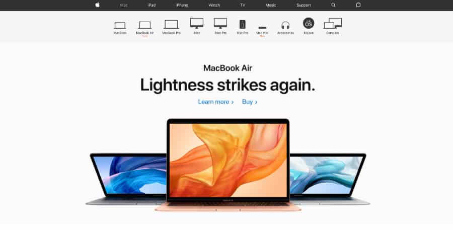
Apple’s use of category relevant sub menus solves a lot of problems nicely. The system gives guidance exactly when it’s needed, helping the visitor at each step.
When used sparingly with well planned intent on a large site, a mega menu can add a deeper level of functionality to the core menu, hence a deeper navigational experience if the visitor so wants it. Keeping the menu as a secondary element, ensures you do not run the risk of overwhelming, instead quite the opposite, by giving the option to dive deeper, without added complexity

Microsoft’s mega menu is secondary, simple and clear. It provides additional information when you want to dig deeper but keeps its main call points in the main menu.
So, if we are not big fans of the mega menu, what are our tips for a good menu structure?

Amazon has A LOT of stuff but keeps the menu to a simple drop down. It then guides the site visitor, through refining and search functions. The system keeps the visitor engaged but provides a direction at each step of their search.
Your site menu is the heart of your site and over a long period of time, people have come to expect to navigate their way through the ubiquitous horizontal bar at the top of a site. As such, what you put there should not only be direct but help a visitor get to where they want without having to jump through hoops.
1. Be to the point. Label your menu items in such a way that they are clear and tell a user exactly what they’ll get when they click it.
2. Avoid drop downs on important items. If it’s important put it front and centre so it can’t be missed. If it has to be included in a drop down i.e. is part of an admin section, make sure the drop down has a clear label that lets people know there is important stuff inside; call it something like ‘Site Information’ rather than a generic ‘About’.
3. Consider second tier menus. Sometimes it’s an option to employ section driven second tier menus that hold links pertinent to the section in question. This avoids adding items to the main menu that need not be there. Apple.com uses a system like this to great effect.
4. Call out drop down menus. Drop down menus are a good way to hold section related links (Amazon does this for its ‘Departments’), just as long as they are not too long. Where you are using a drop down, call it out by using an arrow or a ‘+’ symbol to let the user know there is more under that link.
5. As a continuation of 4, when possible we suggest that a drop down only appears on an ‘on click’ event. Menus that pop out automatically when the user mouses over, known as ‘on hover’, have been a standard for years, but they can not only be annoying but today, where so much is done on mobile (where hover events do not work), keeping functionality consistent across all platforms is a good idea.
5. Avoid secondary drop downs. Ever spent five minuted trying to select a link in a second level drop down menu? Secondary drop down, or ‘fly out’ menus are the bane of a menu system and can create frustrating navigation tunnels for users.
6. Lastly, consider font size and spacing. That small text looks cool but can be hard to read, while bunching it up to save on space (and jam more in there) can make a menu unusable. When thinking cross platform, for tablet sized devices consider having larger menus fall back into a ‘hamburger’. Hamburger menus are a standard on mobile devices so usually do not cause usability issues and can make navigating a site far easier than if the menu text is condensed, or wraps over two lines.
And if you do use a mega menu? Never forget to add a clear and prominent ‘close’ toggle, preferably in the top right of the menu. There is no better way to loose people than to have a mega menu that can not be close… as I surprisingly found with the guardian.com recently.

The Australian Tax Office. The Mega menu is justified here and helps finding what you need